Twenty-five banners for one product, and why none of them is a resize
A brand kit where every placement is drawn for its own shape — from a 320×50 mobile strip to a 300 dpi A3 poster. What each size is for, the rules that keep them recognisable as one family, and the
In this essay
The first version of this brand kit was one design exported at fifteen sizes. It took an afternoon, it looked consistent, and it was useless.
A layout that works at 1500 × 500 does not work at 320 × 50. The headline that fills a Facebook cover is four words too long for a leaderboard. A logo lock-up that is elegant at poster scale is an unreadable smudge at mobile-banner height. Exporting one composition at many sizes produces artwork that is technically the right dimensions and wrong in every single placement.
So we threw it away and drew twenty-five separate pieces. This is what each one is for, and the four rules that keep them looking like one family without being one file.
Rule 1: the shape decides the message
Every placement gets one job, chosen from how much attention it realistically gets and how much room it has.
A profile header is seen by someone already on your page, so it does not need to explain what you are — it needs to look like you. A display ad is seen by someone who has never heard of you and has about half a second, so it needs one claim and nothing else. A poster is looked at deliberately, from a distance and then up close, so it can carry a headline and detail. Same product, three completely different pieces of writing.


The three above are all "wide and shallow", and they are still three different designs — because 191 pixels of height is a single line of type and 312 is two with room to breathe, and because LinkedIn crops the left of that banner behind a logo on most layouts while Facebook does not.
Rule 2: know what the platform will do to it
Every social placement crops. The crop is not the same on desktop and mobile, and it is not documented in a way you can rely on. The practical defence is to keep anything essential — the wordmark, the claim — inside a safe area well within the frame, and let the background be the part that gets eaten.
The link preview is the one people get wrong most often, because it is the one nobody looks at during design. It is the image that appears when your URL is pasted into a chat, a forum or a social post, and it is very often the only impression of your product a person ever forms.

Rule 3: display ads are typography, not pictures
The standard ad sizes are brutal. A leaderboard is 728 × 90. A mobile banner is 320 × 50 — smaller than a line of body text on the page it sits in. A skyscraper is 160 pixels wide and 600 tall, which is a shape almost nothing composes into naturally.
There is no room for a screenshot in any of them. At 90 pixels tall a screenshot is a grey rectangle with noise in it. So these five are built entirely from type, the mark, and one colour field — and each one is written separately, because the number of words that fit differs by a factor of five between the largest and the smallest.



The two tall ones are their own problem. A half page at 300 × 600 has enough room for a claim, a short list and a button. A skyscraper at 160 wide has room for the mark, three or four words stacked, and a button — and if you try to fit a fourth line it stops being legible on a real screen at a real distance.


Rule 4: the square and the vertical are different products
A square post and a nine-by-sixteen story get treated as the same asset constantly, and they are not remotely alike. A square is read in a scroll, at thumbnail size first, competing with everything around it. A story is full-screen, held for a couple of seconds, and — this is the part that changes the design — the bottom fifth is covered by interface, and the top by a progress bar.
So the story pieces put nothing important in the top or bottom sixth, and they are composed to be read in about two seconds. The square is composed to survive being 140 pixels wide in a grid.
Print is a different colour world
The two posters are drawn at 300 dpi — A4 is 2480 × 3508 pixels, A3 is 3508 × 4961. That is not the same design scaled up; type that reads well on a screen at arm's length is proportionally too heavy on a sheet you are standing in front of.
The practical notes for anyone doing this themselves: draw it as vector and rasterise at the end, because text scaled from a screen-resolution export will be soft in exactly the way that looks cheap in print. Keep the darkest background lighter than pure black, because ink saturation on a large solid area causes problems at the printer. And check the contrast of your accent colour on paper, where it will be duller than the screen promised.
The desktop wallpaper belongs in the same conversation for the opposite reason: it is the one piece where the product must almost disappear. Something you look at all day cannot be an advertisement, so it is the colour field and the mark, and nothing else.
The screenshot banners, and one hard rule
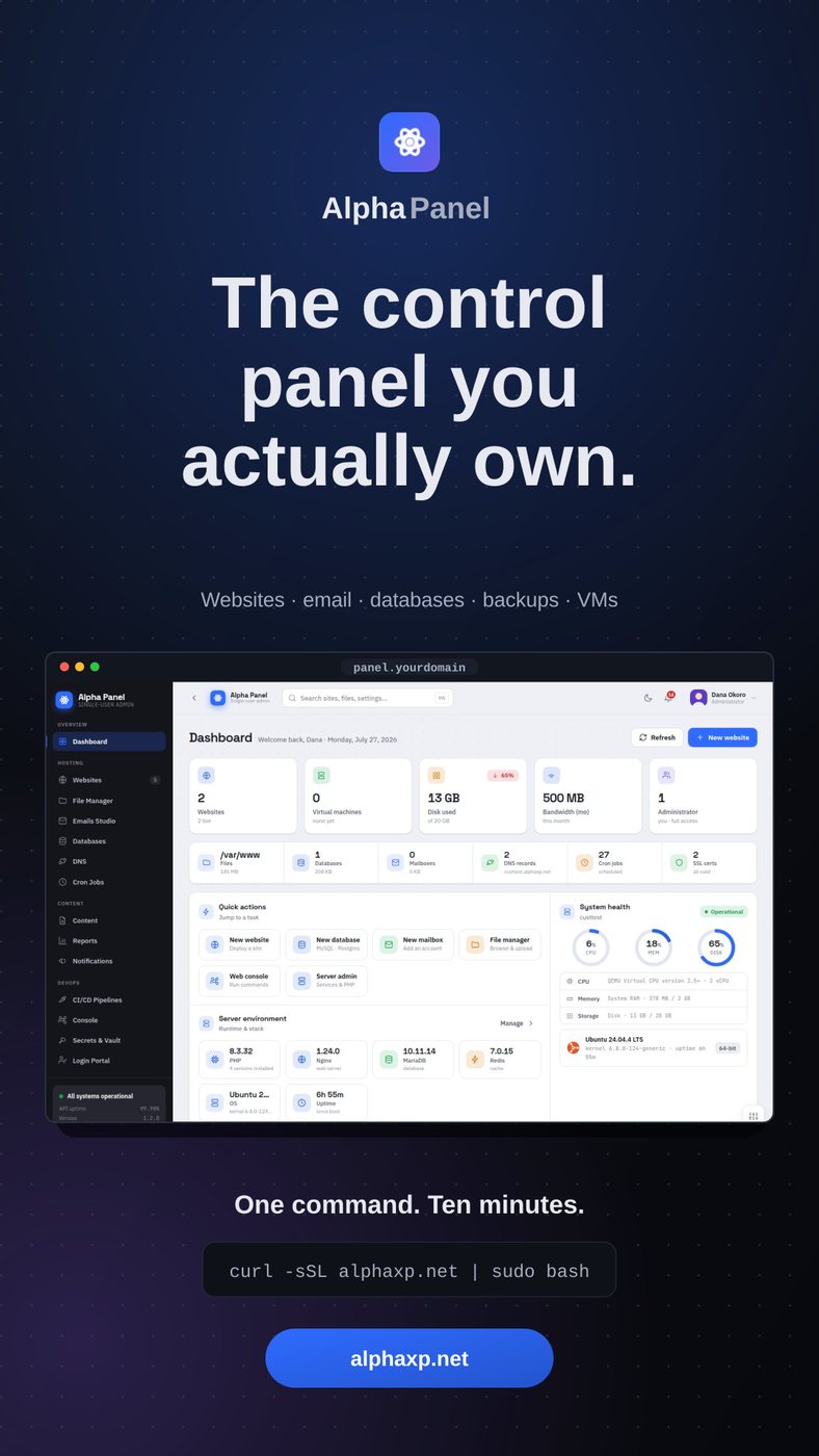
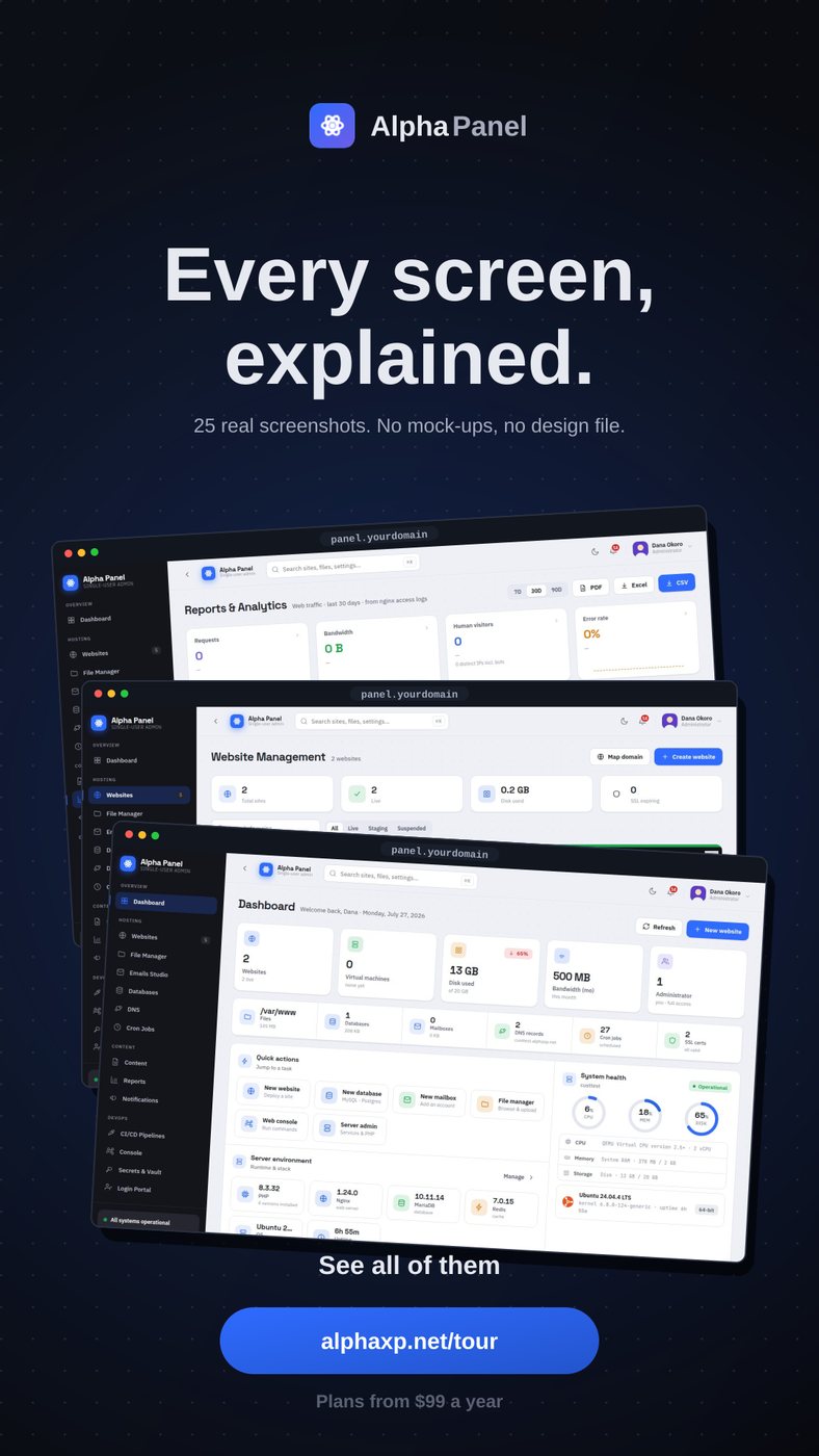
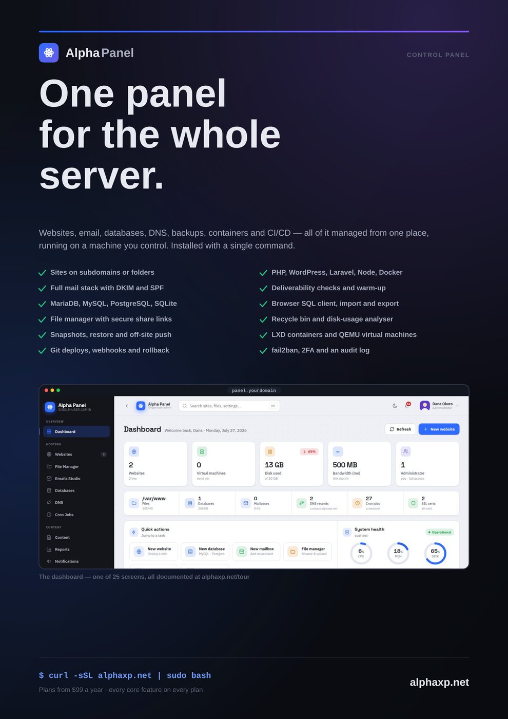
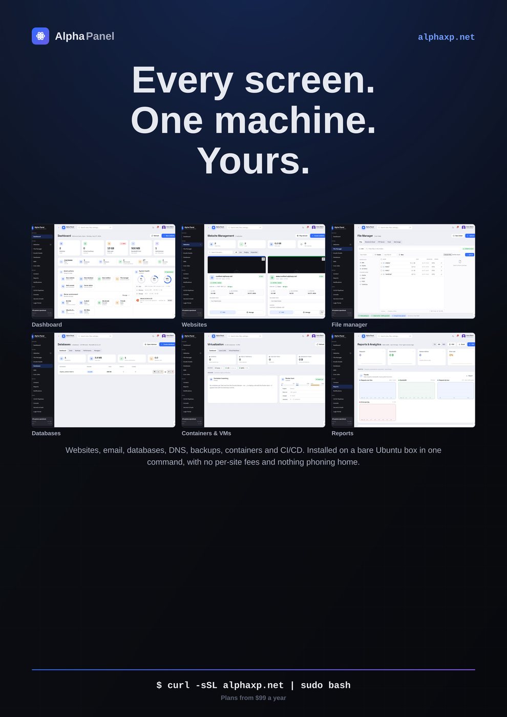
Five of the twenty-five are built around real screens of the panel with the feature written out beside them, plus a collage of six screens for presentations and article headers. These are the pieces that do the actual selling, because a control panel is a visual product and "control panel" as a phrase sells nothing.
The hard rule on all of them: the screenshots are real, and they are masked before capture. Real means an actual authenticated session against a running server, not a mockup — a mockup screenshot is a promise you have to keep later. Masked means anything key-shaped is redacted programmatically before the image is written, because a store image is public forever and a licence key visible in a marketing banner cannot be recalled.
A marketing image is the most-copied artefact you produce. Whatever is in it is in it permanently.Why the masking runs before the screenshot, not after
There is one more rule specific to this product, and it is absolute. The panel lives on a deliberately obscured hostname. That hostname must never appear in anything a visitor can fetch — including the address bar in a screenshot. Every banner is audited for it, and it has been caught twice, which is exactly why the audit exists.
Generate it, do not maintain it
Twenty-five hand-made files is a maintenance problem the first time anything changes. Ours are produced by a script: each piece is a composition function that emits vector markup, which is rasterised at the size and resolution that placement needs. Re-running it regenerates the whole kit.
That sounds like the setup for the mistake described at the top of this article, and the difference is exactly one design decision. The first version drove all fifteen sizes through three shared layout functions, which is what made everything read as one banner exported repeatedly. Every entry now has its own composition function — its own background treatment, its own idea, its own copy — and only the palette, the mark and the type scale are shared code.
The distinction is worth stating plainly because it applies well beyond artwork: automation should remove the labour of producing variants, not the thought. A generator that also makes the design decisions produces twenty-five copies of one decision.
What holds it together
Twenty-five separately composed pieces could easily look like twenty-five different products. Four things are shared and nothing else is: the palette, the mark, the typeface, and the type scale. Not the layout, not the copy, not the crop, not the density.
The mark is loaded from the same file the panel serves as its favicon, which means a rebrand flows into the whole kit the next time it is generated rather than leaving twenty-five files to update by hand. That single detail is the difference between a brand kit that stays current and one that is quietly wrong within a year.
Every one of them is on the site as a download, at full size, grouped by what it is for. Take what you need — for a listing, a campaign, a press page, or a wall.
Uptime monitoring that tells you what actually happened
Every panel shows a green dot. Almost none can tell you how long you were down last month, or that a certificate expires on Tuesday.
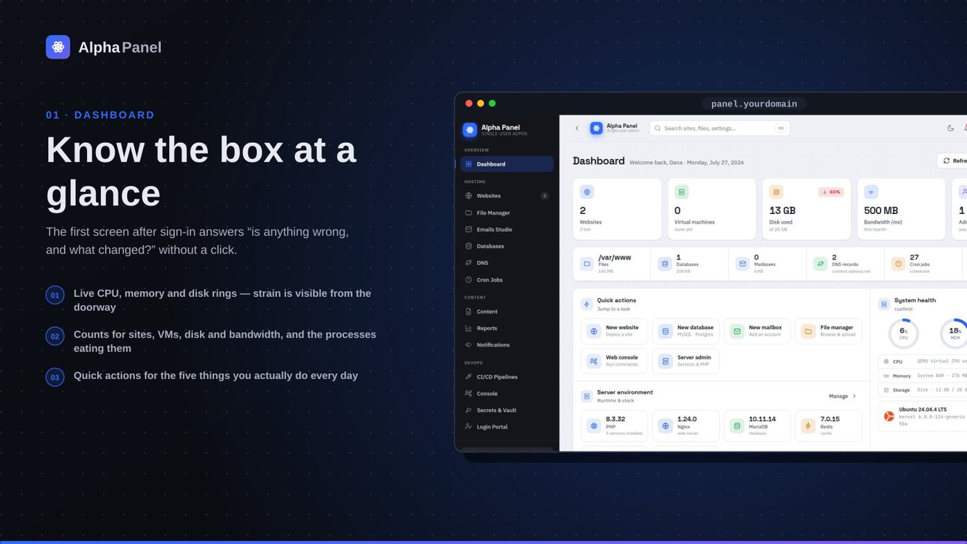
What a server dashboard should tell you (and what most of them don't)
A control panel's front page is the only screen most people ever look at. Here is what ours puts on it, why each number is there, and the ones we deliberately left off.
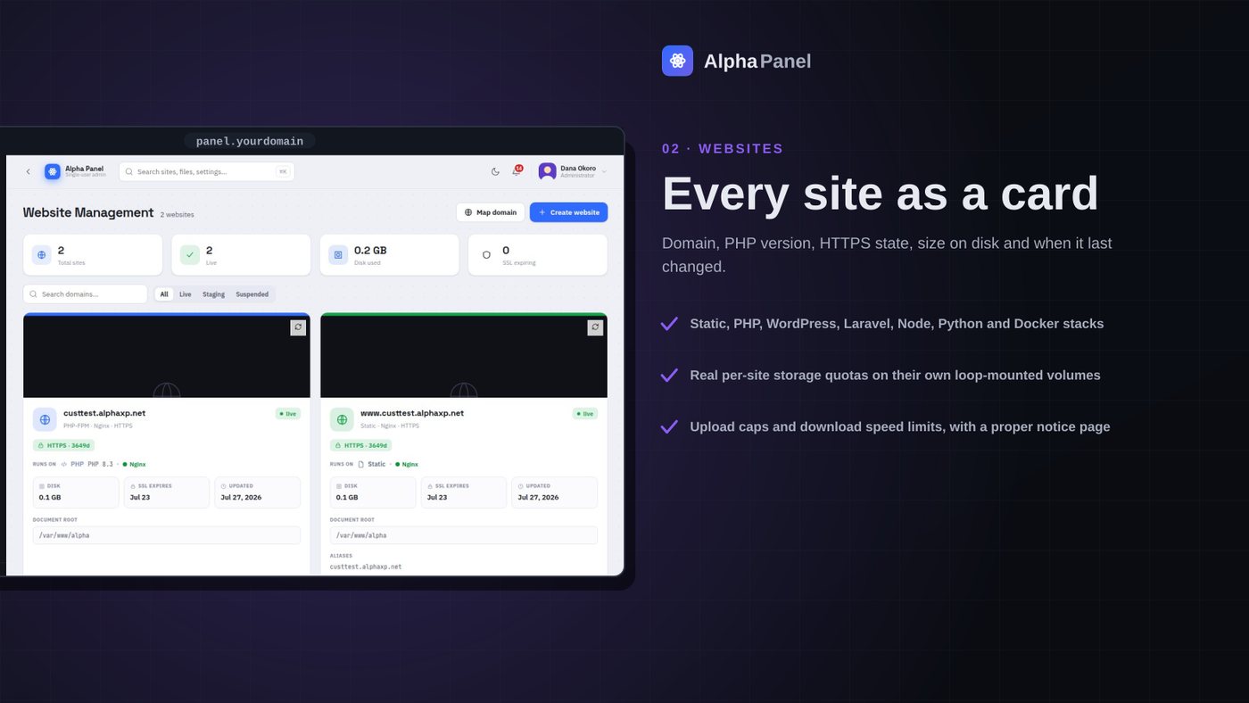
A storage limit that is actually a limit
Most per-site disk quotas in hosting panels are a number in a database that nothing enforces. We made ours a real filesystem the site cannot see past — here is what that took, and what it broke.
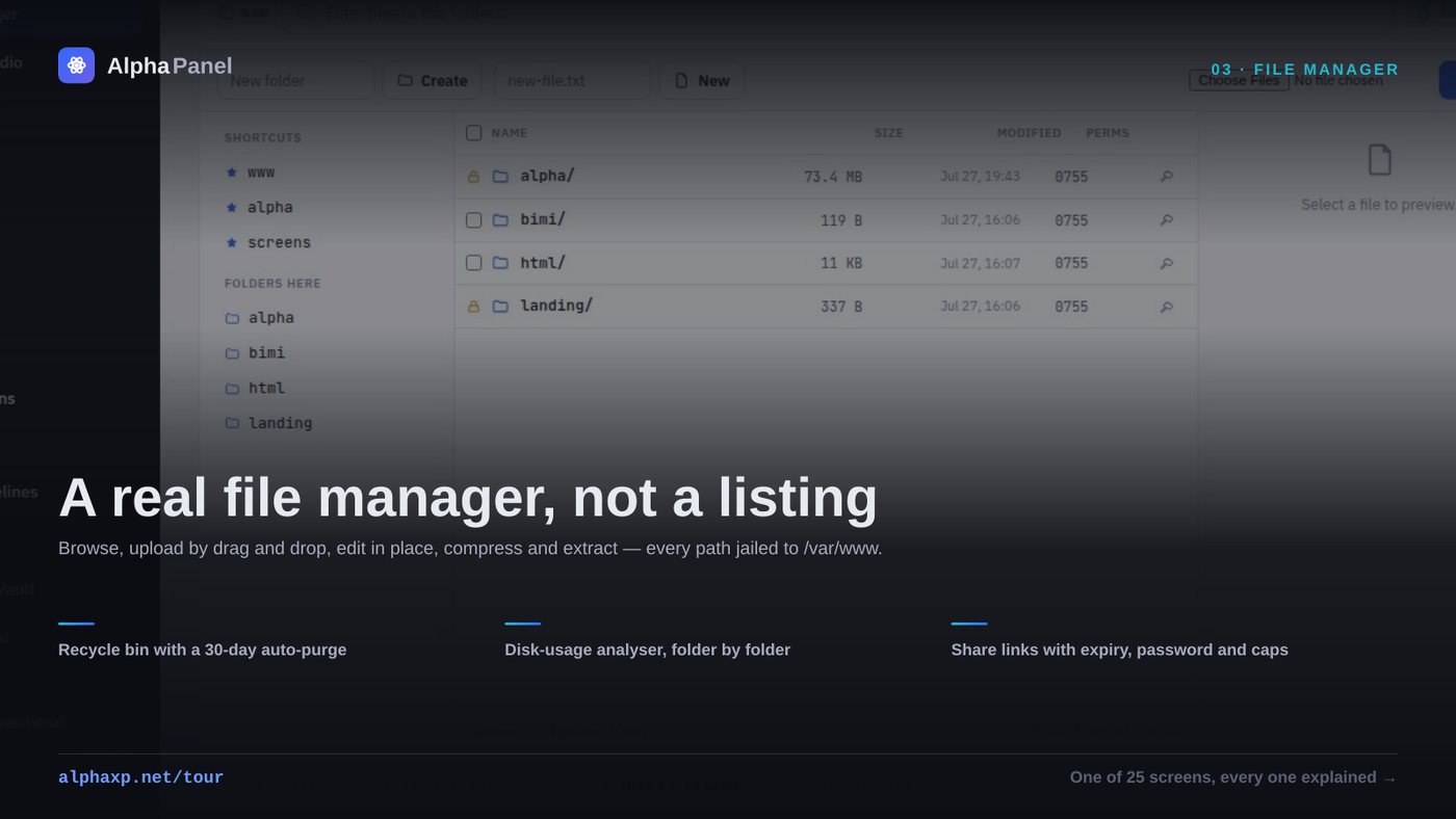
The delete that reported success and did nothing
A file manager is the most dangerous screen in a control panel. This is the bug that taught us that, plus what a browser-based file manager has to get right before anyone should trust it with a produc
Alpha Labs
We build Alpha Panel and run it on the same server it manages.