What a server dashboard should tell you (and what most of them don't)
A control panel's front page is the only screen most people ever look at. Here is what ours puts on it, why each number is there, and the ones we deliberately left off.
In this essay
Open almost any hosting panel and the first screen is a wall of gauges. CPU, memory, disk, a sparkline of something, four coloured circles. It looks like information. Most of it is decoration — numbers that are true but that you cannot act on, arranged so that nothing stands out because everything is the same size.
We rebuilt our front page around one question: if you only look at this screen once a day, what do you need it to tell you? Everything that survived that question is below. Everything that did not is at the end of the article, because the things a dashboard leaves out say as much as the things it shows.
The top row is counts, not gauges
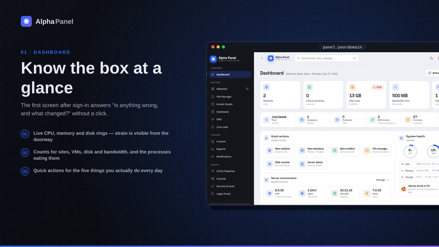
The first strip is five numbers: websites, virtual machines, disk used, bandwidth this month, and administrators. None of them is a percentage-of-something dial, and that is on purpose. A dial tells you a ratio; a count tells you what exists. "16 websites" is a fact you can check against your own memory of what should be there — and the day it reads 17, you have learned something a CPU gauge could never tell you.
Disk is the exception that proves the rule: it shows both, 93.9 GB of 118 GB with a red 80% chip beside it. The chip only appears once the ratio actually matters. Below 70% there is no chip at all, because a disk that is a third full is not news and drawing attention to it every single day trains you to ignore the one day it is not.
The second strip is the same idea one level down — files, databases, mailboxes, DNS records, cron jobs, SSL certificates. These are the things you create and forget, and the count is how you notice drift. Fifteen certificates, all valid. Forty cron jobs scheduled. If either number moves without you moving it, that is worth ten seconds of your attention.
System health, in three numbers and one sentence
CPU, memory and disk get one ring each, and the ring is the only place on the page where we use a gauge, because these three genuinely are ratios. Beside them sits the thing most panels omit: what the machine actually is. The CPU model. Total RAM against used RAM in gigabytes, not just a percentage. The kernel version and how long the box has been up.
That last group exists because of a specific failure mode. When something is wrong at 2 a.m., the first three questions are always the same: what is this machine, how big is it, and did it just reboot? A panel that shows you 52% memory but not that the box has 5.8 GB has answered the least useful of those three.
The status pill in the corner reads Operational — and it is computed, not decorative. It turns when a monitored service is down, when disk crosses its threshold, or when a certificate is inside its renewal window and has not renewed. A green light that is always green is a light that is not wired to anything.
Quick actions: six things, not sixty
Underneath health sits a small grid of actions — new website, new database, new mailbox, file manager, web console, server admin. This is not a menu. The full navigation already exists in the sidebar, and duplicating it here would just be a second, worse menu.
These six are the tasks that people actually arrive intending to do. We picked them by reading the panel's own audit log: every write action is recorded with a timestamp, so "what do people do most" is a query, not an opinion. If your usage differs from ours, the log will say so — and the honest answer is that this row should eventually be personalised from it.
- New website — the create form, with your default stack pre-selected
- New database — MySQL or Postgres, both real, both on this box
- New mailbox — a real account on the real mail server, not a forwarder
- File manager — opens at the web root, not at an empty tree
- Web console — a shell in the browser, session-recorded
- Server admin — services, PHP versions and the storage doctor
Server environment: the versions you forget
PHP 8.3.32. Nginx 1.24.0. MariaDB 10.11.14. Redis 7.0.15. Ubuntu 24.04 LTS. Uptime 43 days. Six tiles, each one a version string you will need exactly when you are debugging something and cannot remember it.
The PHP tile carries a sub-line — 6 versions installed — because a server with more than one PHP is a server where "what version is this" has no single answer. Clicking through goes to the version manager, where each one can be enabled, made default, or removed, and where the panel refuses to remove the version it is itself running on.
Live traffic, from your own logs
The bottom of the page is a requests chart with a 1H / 24H / 7D switch and a per-site dropdown. There is no JavaScript tracker involved, no third-party script, and nothing leaves the server: the numbers are parsed out of the nginx access log that was already being written.
Getting per-site numbers out of that log needed one change that is worth mentioning, because it is the kind of thing that is invisible until you need it. The default log format does not record which vhost served the request. We added vhost=$host to the format — which means the per-site breakdown only works for traffic logged after that change. There is no way to backfill it. If you are going to want a dimension later, add it to the log now.
Analytics you can only get from the future are still worth turning on today.A lesson learned the expensive way
What we deliberately left off
A load-average sparkline. Load average on a modern multi-core box is three numbers that mean something subtly different from what most people think they mean, and a wiggling line of them at the top of a dashboard is pure anxiety generation. The process list — reachable in one click, and genuinely useful — answers "what is eating my CPU" properly, with a per-process dossier.
A network throughput graph. It looks impressive and it tells you almost nothing on a web server, where the interesting number is requests, not bytes on the wire. Bandwidth for the month is in the top strip, which is the form of that number you actually get billed on.
A "security score". Every panel that has one has invented its own scale, and every one of them can be gamed by turning on settings that do not matter. Our security screen shows real state instead — fail2ban jails and their current bans, which ports are open, certificate expiry, whether 2FA and passkeys are on — and lets you draw your own conclusion.
Fake activity. This is the big one. During the first build, the dashboard had a beautiful "recent activity" feed that was hardcoded sample rows. It was the single most convincing thing on the screen and it was a lie, so it went. What replaced it is the real audit log, which is less pretty and occasionally boring, which is what a true one looks like.
How the page loads without being slow
A dashboard that reads everything live has an obvious problem: reading everything live is expensive. Disk usage means walking a tree. Certificate expiry means parsing certificates. Service state means asking systemd about each one. Done naively, the front page becomes the slowest screen in the product, which is a fine way to make people stop opening it.
Three rules keep it quick. First, anything that requires walking the filesystem is cached with a short time-to-live and a visible timestamp — the disk-usage scan says scanned 14:32 under it, so you always know how fresh the number is and can force a rescan. Second, anything that shells out runs once and is parsed once; the old version called out separately for each service and spent most of its time in process creation. Third, the heavy per-site traffic breakdown loads after the page, not with it, so the layout appears immediately and fills in.
The measurable result: the front page renders in well under a second on a four-core box that is also serving sixteen websites, a mail server and a couple of containers. That is not a benchmark to brag about — it is the bar below which people stop trusting a page enough to leave it open.
The rule underneath all of it
Every number on this page is read from the machine at the moment you load it. Nothing is cached longer than it takes to compute, nothing is sampled from a made-up dataset, and every screen has a rule that if a capability is not wired up yet, it says so plainly rather than showing a plausible number.
That sounds obvious written down. It is surprisingly hard to hold to, because a mock number always looks better than an honest "not configured" — right up until the day someone makes a decision based on it.
Uptime monitoring that tells you what actually happened
Every panel shows a green dot. Almost none can tell you how long you were down last month, or that a certificate expires on Tuesday.
What a server dashboard should tell you (and what most of them don't)
A control panel's front page is the only screen most people ever look at. Here is what ours puts on it, why each number is there, and the ones we deliberately left off.
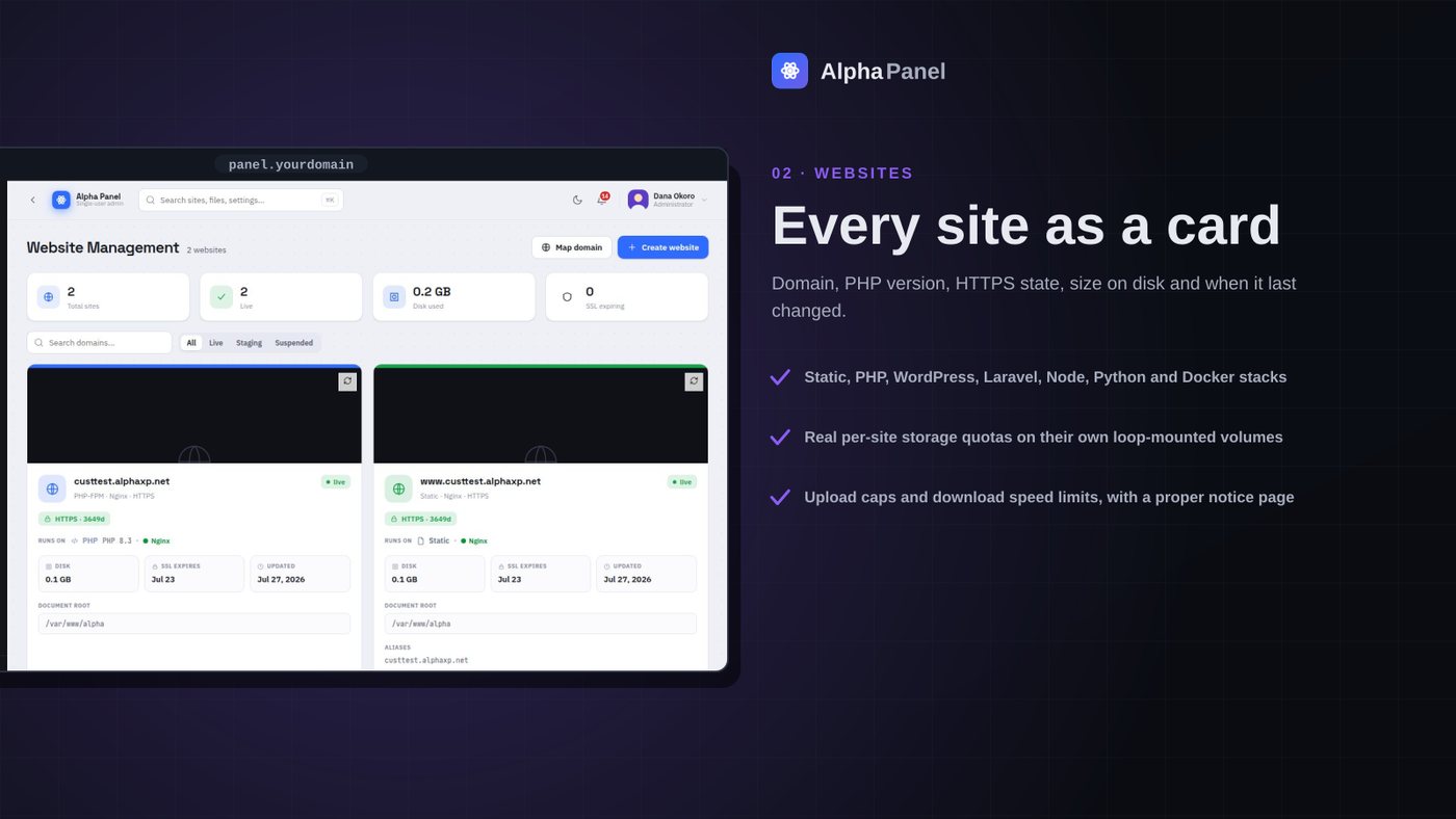
A storage limit that is actually a limit
Most per-site disk quotas in hosting panels are a number in a database that nothing enforces. We made ours a real filesystem the site cannot see past — here is what that took, and what it broke.
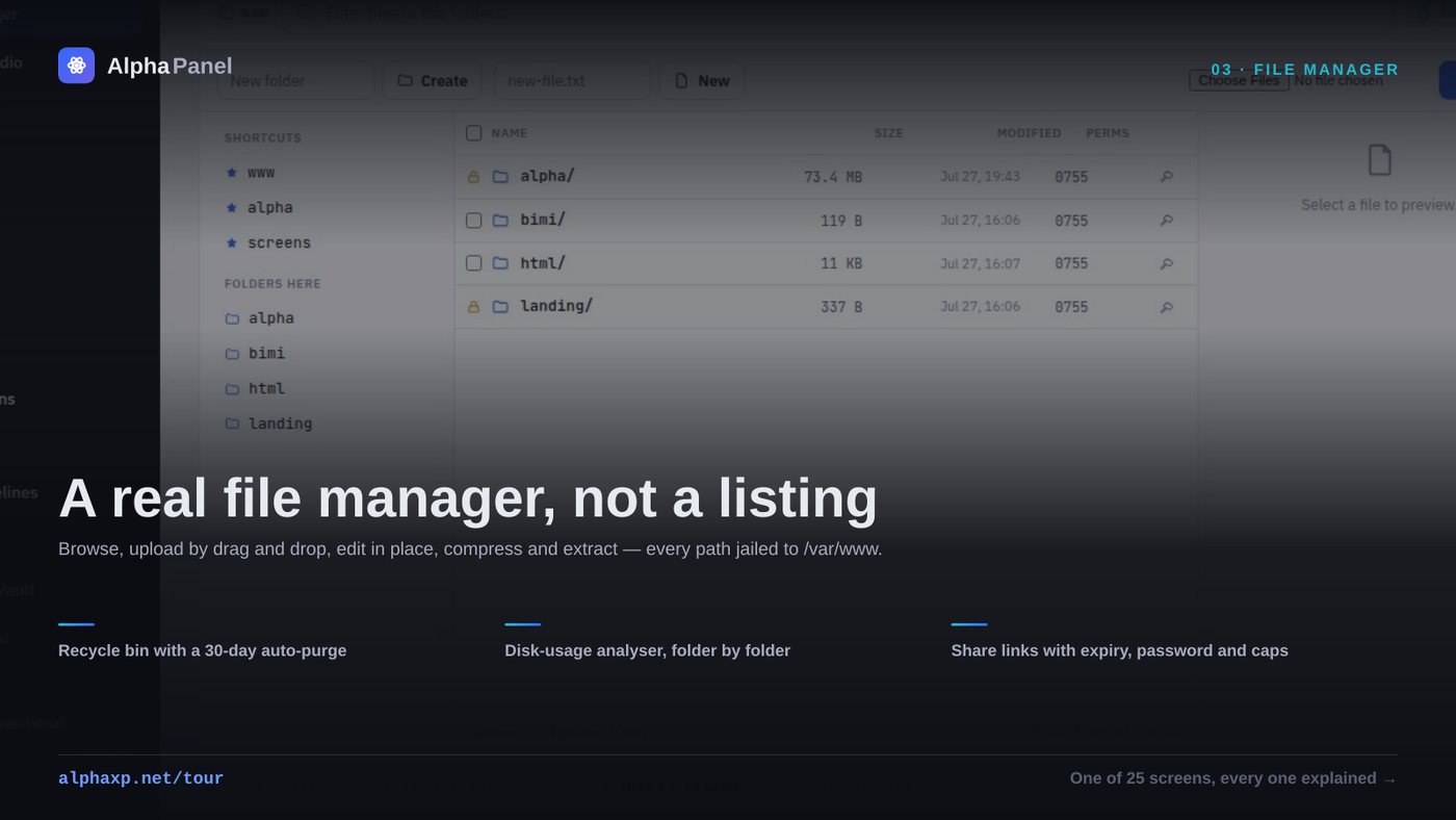
The delete that reported success and did nothing
A file manager is the most dangerous screen in a control panel. This is the bug that taught us that, plus what a browser-based file manager has to get right before anyone should trust it with a produc
Alpha Labs
We build Alpha Panel and run it on the same server it manages.